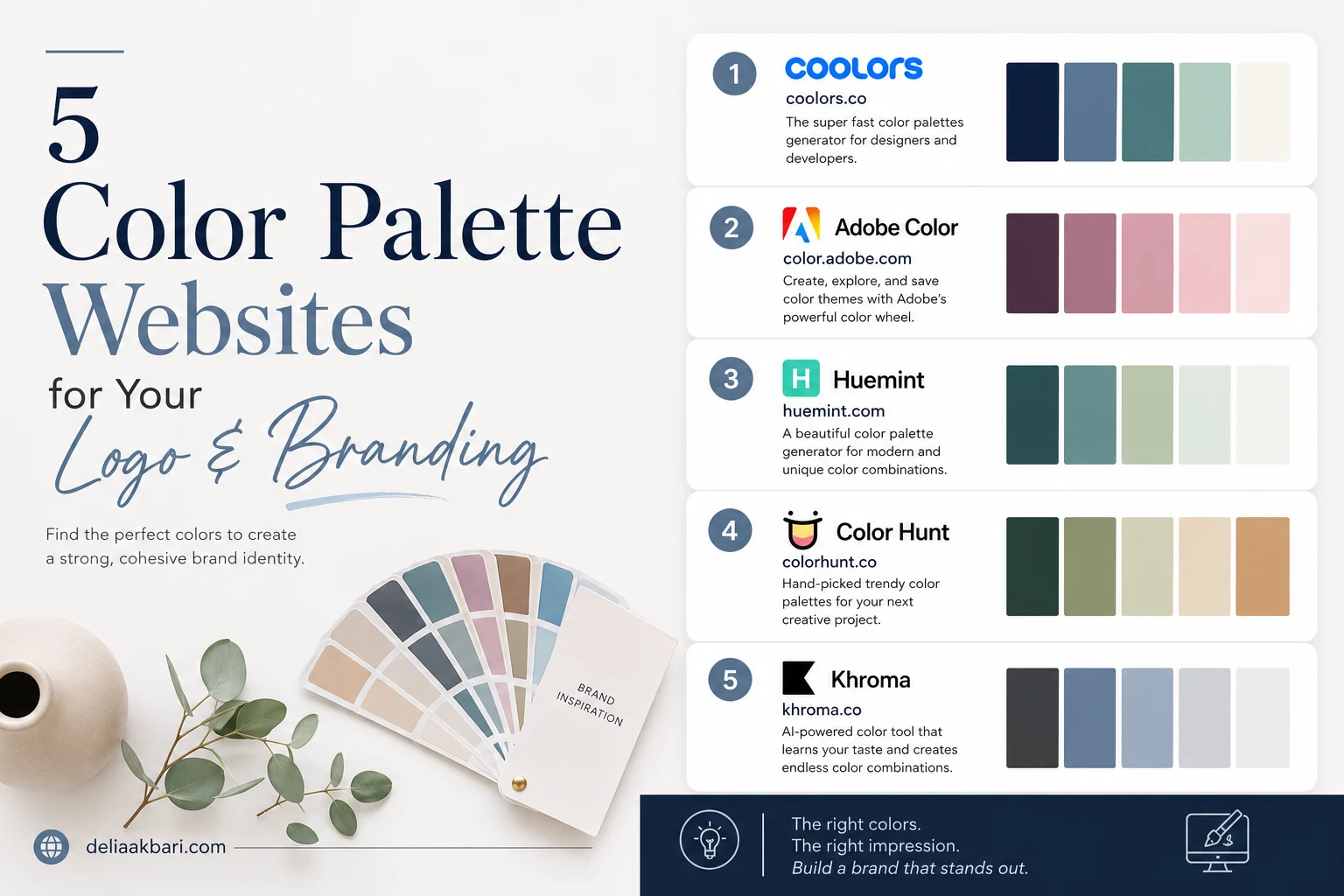
Choosing brand colors is the step where most small business owners stall. You know roughly what you want, warm, or modern, or not-corporate-blue, and then you open a color picker and there are sixteen million options and no way to judge whether any of them are right.
The fix isn't more choice. It's a starting point that somebody already tested. These five sites give you exactly that: real palettes, already balanced, that you can steal, adjust, and take to whoever is designing your logo. All five are free to use without an account, and I've listed them roughly in the order I'd open them.
Coolors
The trending page is thousands of palettes that other designers have already built and saved, sorted by how many people liked them. That popularity filter matters more than it sounds: you are looking at combinations that have survived a lot of eyes, not a random generator's first guess.
Scroll until something stops you, click it, and you get every hex code, a shade range for each color, and one-click export. If you want to build rather than browse, the generator lets you lock the one color you already know, your logo blue, say, and hit space to reshuffle everything around it until the rest of the palette fits.
Adobe Color
This is the color wheel, with the rules built in. Pick your main brand color, then choose a harmony, complementary, analogous, triadic, and it calculates the colors that mathematically work alongside it. If you already have one color you have to keep, an existing logo, a paint color in your shop, this is the fastest way to find what belongs next to it.
The reason it's on this list ahead of prettier tools is the accessibility tab. It will tell you outright whether your text color and background color pass contrast standards, which is the single most common way a beautiful palette becomes an unreadable website.
Huemint
Most palette tools show you five stripes side by side. Huemint shows you the palette applied to a website mockup, a brand layout, or a logo, so you can see which color is doing the heavy lifting and which one only works as a small accent.
This is the difference between a palette that looks great as swatches and one that survives contact with a real page. A saturated orange can be stunning in a stripe and overwhelming as a page background, and you find that out here in about four seconds instead of after the site is built.
Color Hunt
A curated wall of four-color palettes you can filter by feeling rather than by color theory: warm, vintage, pastel, retro, nature. When a client tells me they want something "earthy but not boring," this is where I go, because it lets you shop by the adjective instead of guessing at hex codes.
Four colors is also a genuinely useful constraint for a brand. It is roughly what you need and no more: a background, a text color, a brand color, and one accent for buttons.
Khroma
Khroma opens by asking you to pick fifty colors you like. It then trains on your choices and generates endless combinations in your taste, shown as type, gradients, and images rather than plain swatches.
The setup takes a couple of minutes, which is why it's last. But if you have looked at four hundred palettes and rejected all of them without being able to explain why, this is the tool that figures out the pattern you couldn't name.
Before you commit to anything, run your text color against your background color through the WebAIM Contrast Checker. It is free, takes ten seconds, and gives you a pass or fail against accessibility standards. Light grey text on a cream background is the most common failure I see on small business sites, and it is the kind of thing that is painful to fix after the logo, the signage, and the business cards are already printed.
How to Actually Choose, Once You Have Options
Finding palettes is the easy part. Narrowing to one is where people get stuck, so here is the shortlist I run through:
- Three colors and one accent. A background, a text color, a brand color, and a single accent reserved for buttons and links. If everything is a brand color, nothing stands out, and your "Call Now" button disappears into the page.
- Pick for your customer, not your taste. Deep purple and lavender reads modern and creative. It is the wrong signal for a plumbing company whose customers are looking for dependable and established. The palette is a promise about what kind of business you are.
- Check it in greyscale. Desaturate the palette. If two of your colors turn into the same grey, they will read as the same color to a colorblind visitor, and roughly one in twelve men is.
- Test it small before you test it big. Your logo will appear as a 32px favicon and on a business card long before anyone sees the full brand board. Colors that only work at billboard scale are a trap.
- Then use it everywhere. The same palette on your site, your Google Business Profile photos, your invoices and your signage builds recognition. A palette that changes every year builds nothing.
A Warning About Trends
Every one of these sites has a trending section, and trending is a great starting point and a terrible finishing point. A palette that is everywhere this year is, by definition, a palette that will date your brand to this year. If you want to know which 2026 colors are worth borrowing and which ones belong to big consumer brands with rebrand budgets, I went through that in detail in web design trends actually shaping 2026.
Pick something you can live with for five years, not five months. And when you are ready to see it on a real site rather than a swatch, that is the part I can help with. Colors are a decision, but a site that uses them properly, with enough contrast, a button people can find, and a look that holds up on a phone, is the actual work. Here is what that looks like in practice.