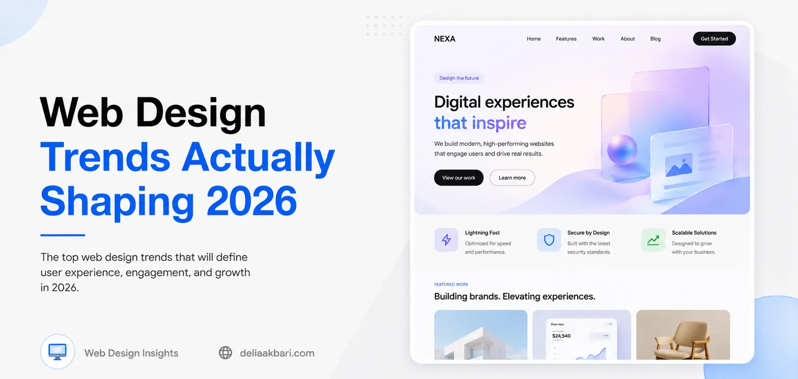
Every year brings a fresh batch of "trends" for websites, and most of them are built for portfolio pieces and product launches, not for a plumber's site or a bakery's. Some 2026 trends are genuinely useful for a small business site: they build trust faster, hold attention longer, and make a brand feel current. Others are expensive, high-maintenance, and wrong for a business that needs to load fast, rank well, and convert a visitor into a phone call. Here's the difference, and the color palettes carrying it all.
What's Actually Changing in 2026
For the last several years, "clean" mostly meant flat: white backgrounds, a single accent color, safe sans-serif type, generous whitespace. That look isn't going away, but it's no longer enough on its own to feel current. Sites are picking up more texture, more warmth, and more personality this year, while the things that used to be treated as optional extras, accessibility and speed, are now just baseline expectations. The shift isn't toward more decoration for its own sake. It's toward sites that feel considered rather than templated.
Design Styles Worth Building Into a Real Site
These are the shifts that hold up outside of a design showcase, the ones that actually help a small business site look current and convert better.
- Organic, off-grid layouts. Instead of everything locked to a rigid three-column grid, sections overlap slightly, images bleed off the edge, and shapes get softer. It reads as more human and less assembled from a template.
- Bold, confident typography. A distinct serif or a characterful display font paired with a clean sans is doing more branding work than a logo alone. Oversized headlines are being used as a design element, not just a label.
- Warm maximalism. After years of flat white cards, sites are layering in color, subtle grain, and tone-on-tone shapes instead of leaving everything on plain white. It's controlled, not cluttered.
- Dark mode as a real option. Not every site needs it, but for portfolios, restaurants, and anything visual, a genuinely designed dark version (not just an inverted color filter) is becoming standard rather than a bonus feature.
- Functional motion. Animation earns its place by guiding attention: a hover state that confirms a click landed, a scroll reveal that paces a long page. Motion that exists purely to look impressive is what usually gets cut first when a site needs to load faster.
- Accessibility and speed, from the start. Contrast ratios, keyboard navigation, and load time aren't a final QA pass anymore. They're part of the design brief from day one, because Google and real visitors both penalize sites that get them wrong.
3D product viewers, AR try-ons, gamified points systems, AI chat agents that write their own copy. These show up on nearly every "2026 trends" list, and they're genuinely interesting for a large consumer brand with a dedicated dev team and a budget to match. For most local businesses, they add cost and complexity without moving the number that actually matters: calls, bookings, and form submissions. Spend that budget on the fundamentals above instead.
The Color Palettes Driving 2026
Color is where 2026 is the most visible. Pantone's color of the year is Cloud Dancer, a soft, lofty white built around calm rather than statement-making. WGSN went the other direction with Transformative Teal, a deep blue-green tied to sustainability and the ongoing biophilic design trend. Butter yellow is holding over from last year, and a sharp chartreuse (Pinterest calls it Wasabi) is showing up as a jolt of contrast against otherwise muted palettes. None of those work well as a whole-site color scheme on their own, but they're showing up constantly as accents inside the combinations below, which are the palettes actually being built into full sites right now.
Warm Minimalism
Bone, sand, and charcoal. Quiet and restrained, reads expensive without trying hard.
#F2EDE4#C8B49A#2E2E2EQuiet Luxury
Champagne, warm taupe, graphite. Suits studios, salons, and services selling on trust.
#E8D5B0#8C7B6B#3D3D3DDigital Botanical
Deep forest, moss, cream. Rooted in the same biophilic mood as Transformative Teal.
#1E3A2F#5C7A5A#FAF3E0Tech Violet
Deep purple, soft lavender, off-white. Reads modern and a little unexpected for a local brand.
#3B1F6E#B8A9D9#F8F6FFRetro Digital
Electric teal against warm cream and deep navy. High energy, best for a brand that wants to stand out.
#00B4A6#FFF8E7#0D1B2AWarm Industrial
Rust, raw linen, iron grey. Grounded and a little rugged, works well for trades and makers.
#B5451B#EDE0CE#4A4A4AChoosing a Palette for Your Own Brand
None of these palettes matter if they don't fit the business wearing them. Before picking one because it's trending, run it through a few practical checks:
- Match the palette to the audience, not the moment. Tech Violet suits a modern studio or startup-adjacent brand. It's the wrong call for a 30-year-old family-owned contractor whose customers value being established and dependable.
- Keep it to three anchor colors and one accent. A background, a text color, a brand color, and a single accent for calls to action is enough. More than that and buttons stop standing out.
- Check contrast before committing. A palette that looks great in a mockup can fail accessibility standards once it's holding real body text. Test your text-on-background pairings, not just the swatches side by side.
- Consistency beats trendiness. A palette a customer recognizes across your site, your Google Business Profile, and your signage builds more trust over time than one that chases whatever's popular this year.
Trends are useful as a starting point, not a checklist to complete. The businesses that get the most out of a 2026 redesign are the ones that pick two or three of these ideas that genuinely fit their brand, execute them well, and skip the rest. If your current site is still running on last decade's playbook, start with what actually makes a small business site good in 2026, then make sure it loads fast enough for any of this to matter.